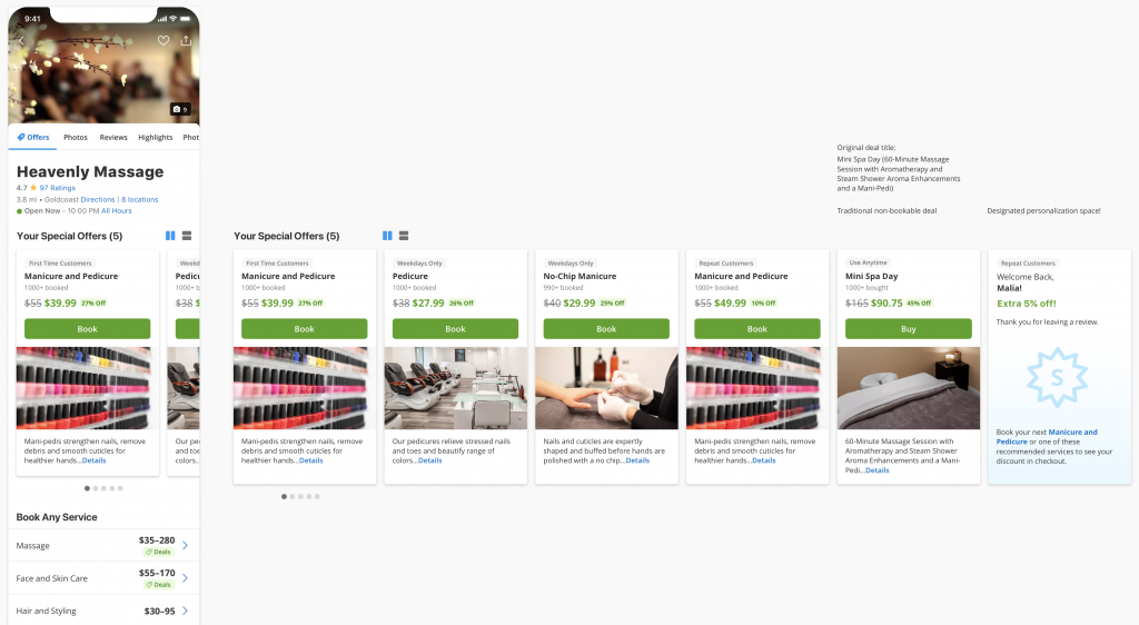
Over-design it…under-design it…how many different ways could we cue attributes, details, redemption type? Quantity can lead to quality and that’s where this page redesign of took me.
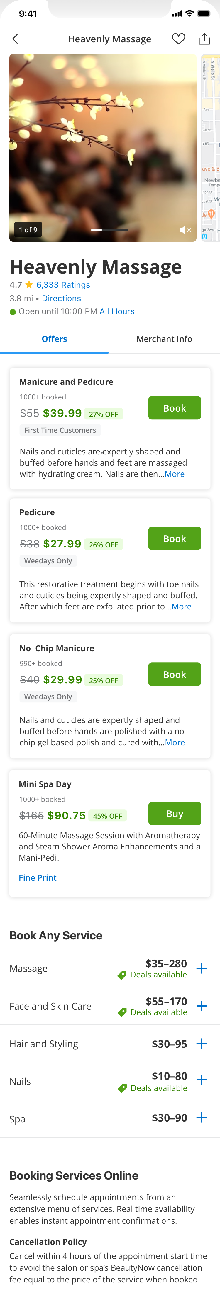
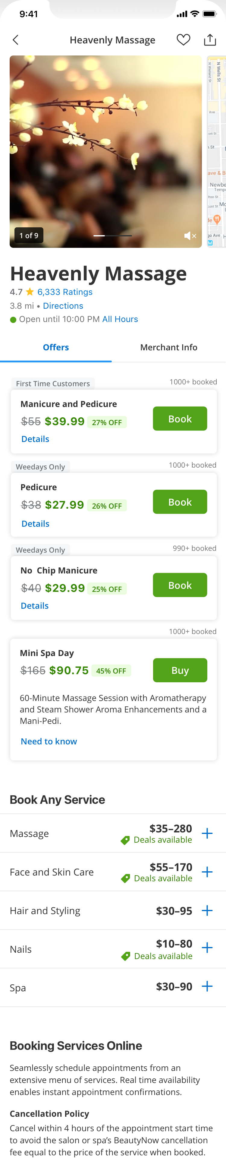
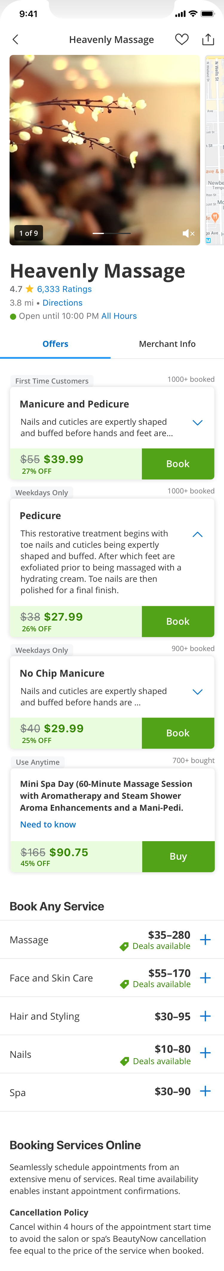
Aggregating deals into a single merchant offerings page meant rebuilding offer modules to include attributes and CTAs specific to the offer, no longer at page level.
Data told us a lot about what worked best, in what format, and in which placement. While trying to hold true to what we knew, I also knew that this redesigned page overall was a disruption that would require realignment of the page/component hierarchy and lead us back to square one.
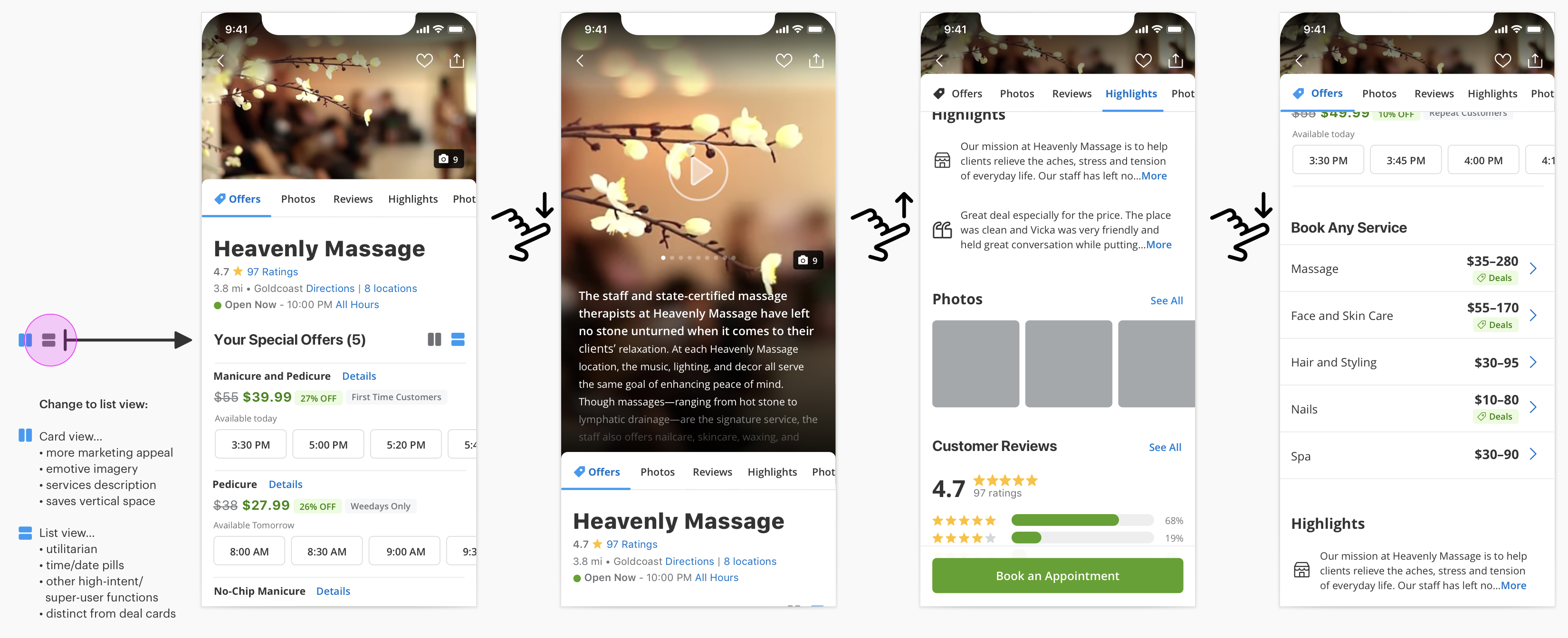
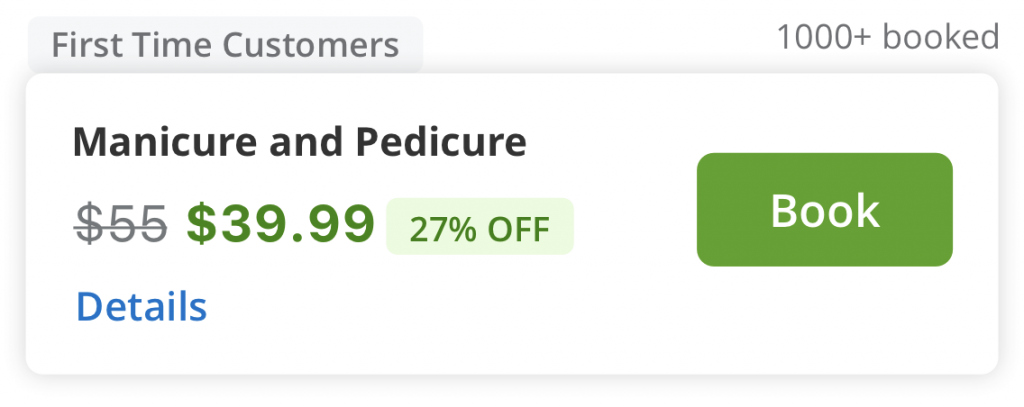
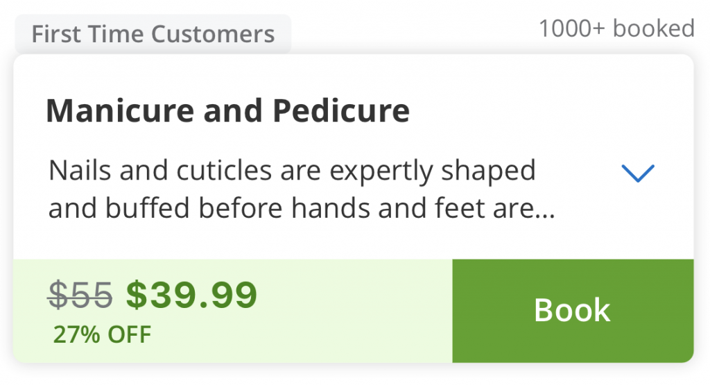
Our offer modules included urgency messaging, social proof, a long title or short title, an optional description, deal attributes, strikethrough pricing, deal pricing, item level sale pricing, discount badge, and CTA. There were also new features being designed in tandem that we just had to save space for or circle back later.

In the end, we needed to launch our MVP with a minimized engineering scope so module redesign was tested but delayed until after our beta release. With design and product consensus, we roadmapped our overflow library of new behaviors and components for future experiments.