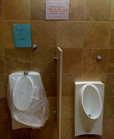
I took this photo a decade ago when they installed flushless/waterless urinals in the restrooms just outside our design pod. They were to be revolutionary in how little maintenance they require and how much water they save. And then…

What was cool about working at Hilton HQ was that we were often guinea pigs for products being considered for use in the hotels. Much like the awesome espresso machine that sat uncleaned and broken down much of the time in the cafeteria. I tell you, maintenance kills many good ideas. Is it something about our culture, lack of foresight, prevention, time? Another topic entirely…I digress.
I was in awe of the clean lines and minimal design but skeptical of function. Some disappointment came when my 4-year-old suddenly discovered the child urinal was too high for him to use. The design requires a lot of drainage in the basin so the lip of the receptacle is much higher and the installation sat at the same height as the previous one. This was a major let down after an exciting build up—independent peeing at age 4 is such a big deal.
However, that was a minor blow compared to the problems of daily adult use. Soon a sign went up, albeit 2 feet higher than the average line of sight—glaring usability 101 error with the restrooms being just outside our UX department. The sign read “Please do not pour coffee, tea, soda, etc, into the urinals. This will cause them to clog.”
Installing the new urinals was a major investment of time and energy requiring closings of restrooms, new plumbing, and retiling surfaces, so I knew they were expected to be permanent. But I feared this maintenance issue to be a deal beaker. You suddenly put these finicky flushless urinals in front of people who have been raised on toilets being disposal devices and you’re asking for trouble. Sure enough, even with the signs, I’d often find chewed gum in the drains. PHHT! Later, I noticed one urinal with a build up of…uh…fluid at the drain. I began refraining from using it, but others were not so attentive. Finally an out-of-order sign went up just above it. I was relieved that potential disaster had been averted. But within a day, the sign disappeared and the puddle at the drain reemerged, and grew deeper, and darker, and yes, just plain more disgusting.
It’s flushless…why is it also not self-unclogging if it’s so innovative?
It was like no one knew what to do. Should we keep using it? Should someone say something? It’s flushless…why is it also not self-unclogging if it’s so innovative? Finally, the drain cover and some thick metal ring was pulled out and laid over the top of a clear garbage bag covering the urinal. A hand lettered out-of-order sign was taped to the wall above it.
This entire event leaves me thinking about the immediate cost and investment in innovation compared to long-term benefits. The subject often comes to mind while using gas pumps and driving past clunky yellow school buses. We all rely so much on the design of certain products that it’s hard to imagine them differently or to reconcile that those designs were probably not the best way to do things from the very beginning. And then every other product in relation becomes so accommodating to the flaws that their uses are learned, accepted, and integrated into a pattern of behaviors that is more of a pain to change for the better than engage.
In all design, when you take chances, you really have to be on top of the follow-up. Or no matter how life-changing your work is, some people won’t want their lives changed and will just continue to clog your drain. And sometimes intuition only goes so far. With the permissive, prolific and perpetual distraction and exhaustion in our fast-and-cheap society, it’s best that you expect to have to use the three E’s: engineer, execute, and educate.
