While auditing for a new feature expression throughout the user journey, one key problem stood out. Our new inventory surfaced in map view was easily confused with our regular offerings.
He wants this one blue and that one green.
Product Manager
But what do you do when your product partner tells you the CEO wants this one blue and that one green? Yes, it’s that very cliched designer’s conundrum that happens even with the best team and best intentions. And what seems like a simple request needs to be met with a somewhat rudimentary process.
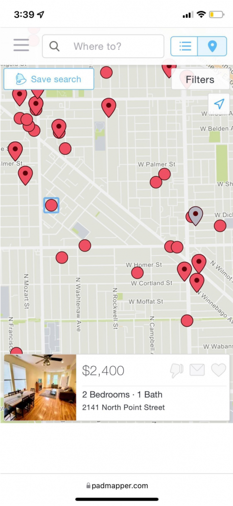
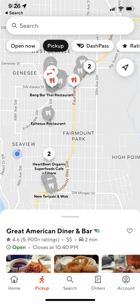
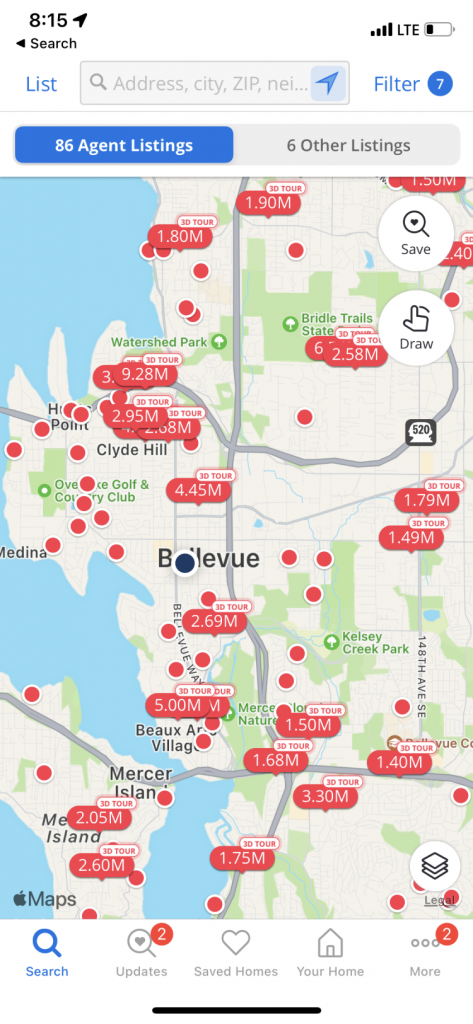
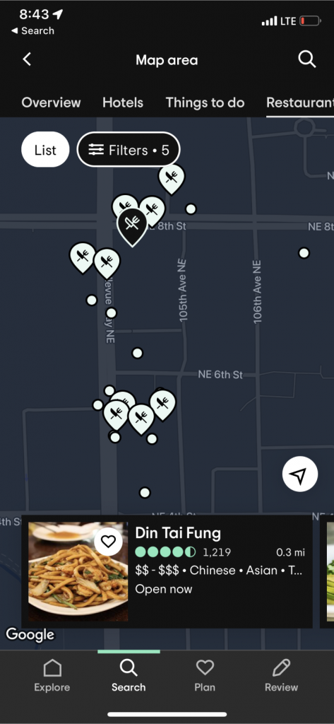
First you clarify what anyone thinks is being achieved by the hurried solution. For us, the actual problem at hand was not blue or green, it was “differentiation.” While everyone’s obvious solution was to add a new map pin color, I brought several issues to the team’s attention.
- Is distinguishing with color an accessibility risk? (Spoiler: yes!)
- Do we have scope space to add a differentiated shape—we’ve surveyed this as a best practice.
- Is the ask really to add a new color, or to differentiate inventory?
- Do we really want to drive change to our established design system for an unproven MVP?
- The preference is to release, gather data, and react/iterate accordingly.
- We are now compounding complexity in our icon system—we should reset the baseline and simplify icon use to be inventory specific, not category specific.
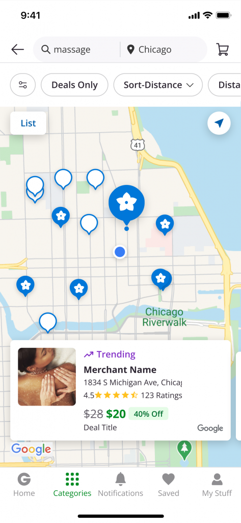
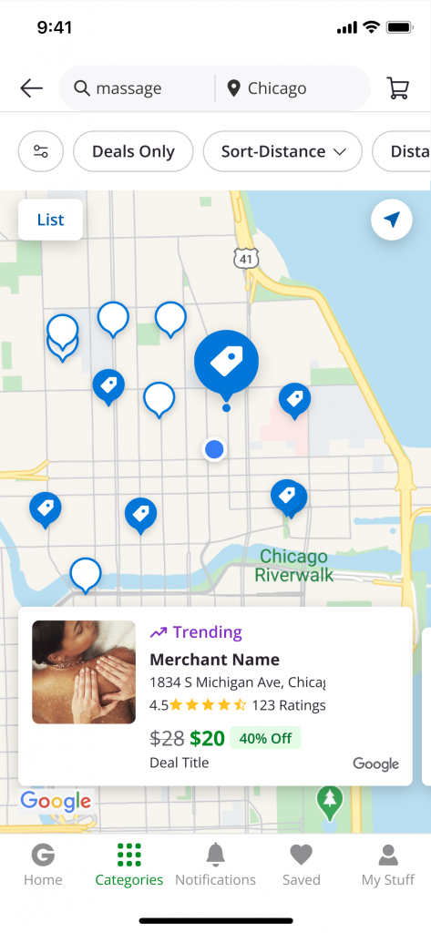
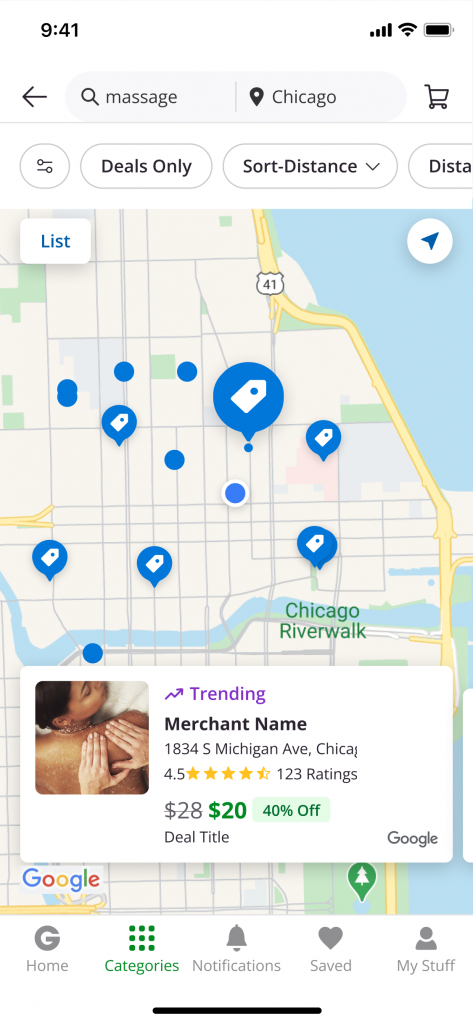
We then audited other apps’ maps for best practices in distinguishing pinned places and presented our case and recommendations to executive leadership within two business days. We successfully executed our MVP from our team’s design iterations which offered the engineering team various acceptable levels of effort based on our time constraints set by the executive team.
