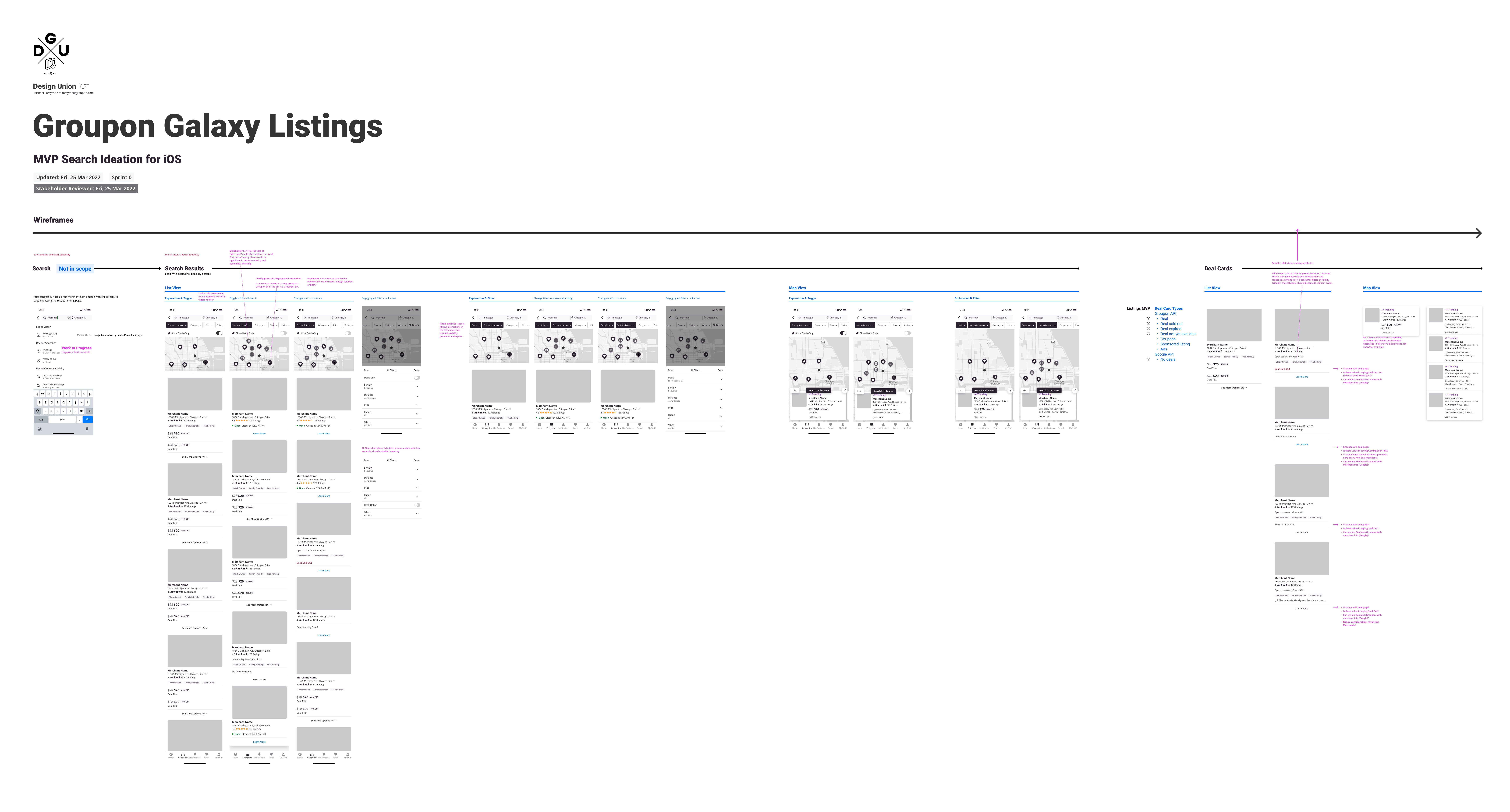
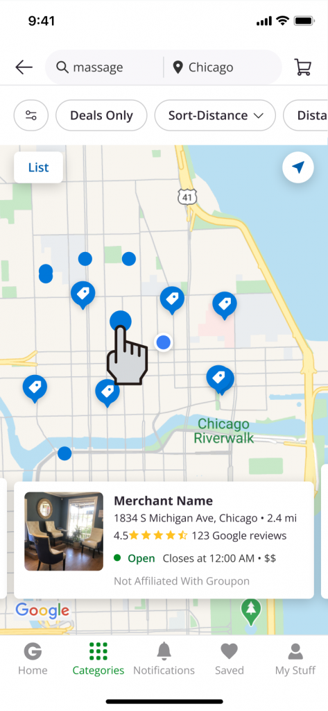
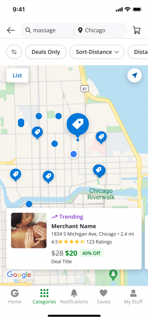
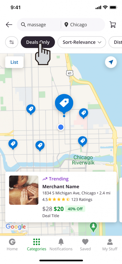
Deal density is a big deal for a hyper-local marketplace. On a map view especially, it becomes even more clear where sales are a challenge and consumers are not incentivized. For a quick read, we decided to anchor our consumers in intent-fulfillment regardless of any discount or platformization and put more merchants on our map. We used Google Places API to boost category results and we highlighted decision-making factors such as location and ratings.
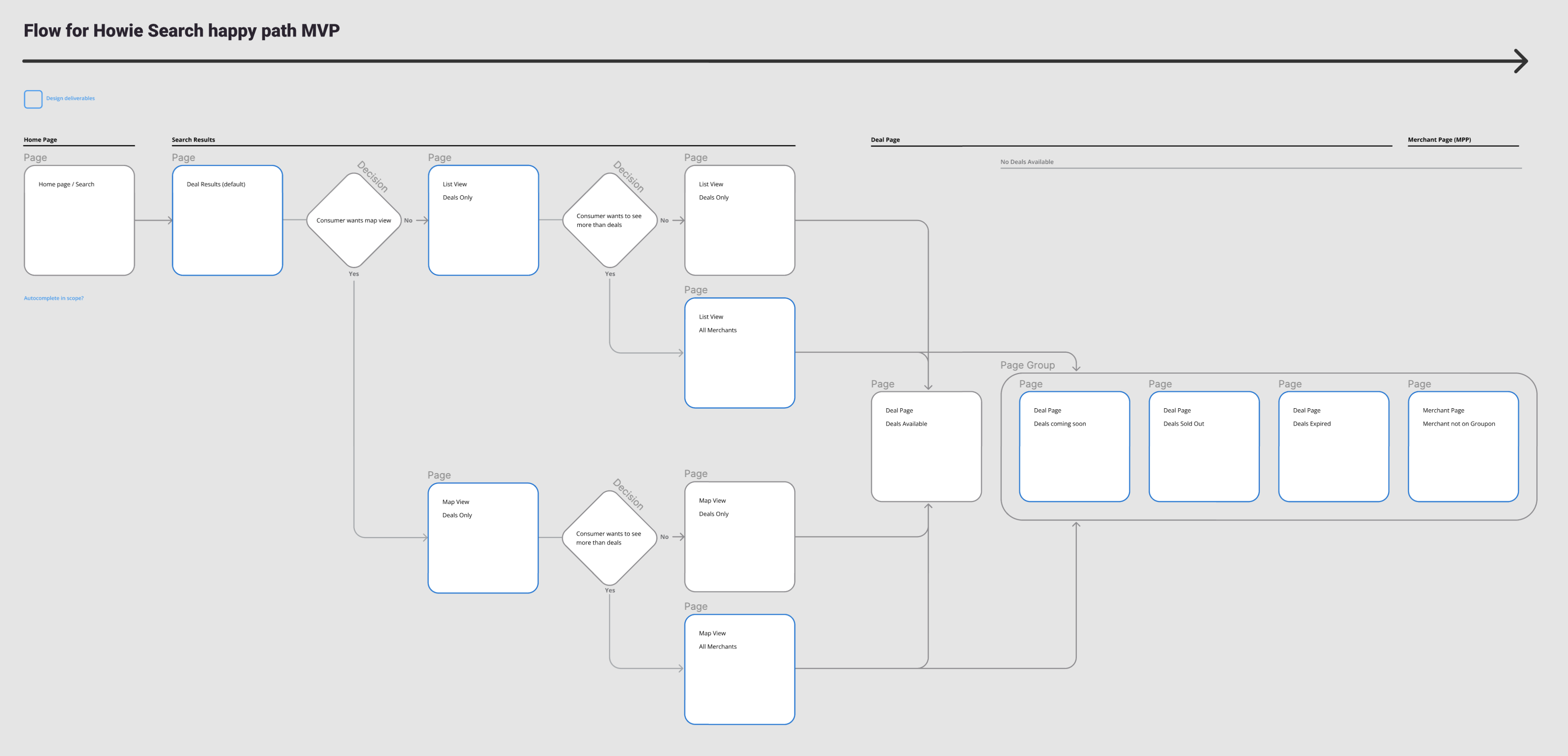
We had new challenges.
- What data do we actually get from Google Places?
- Will that data be enough to incentivize consumers?
- What data do we actually get from Google Places?
- What are the legal requirements for representing non-platformed businesses as Groupon inventory?
- Does that data align with our existing design components?
- How do we differentiate this “inventory” on maps and in deal feeds?
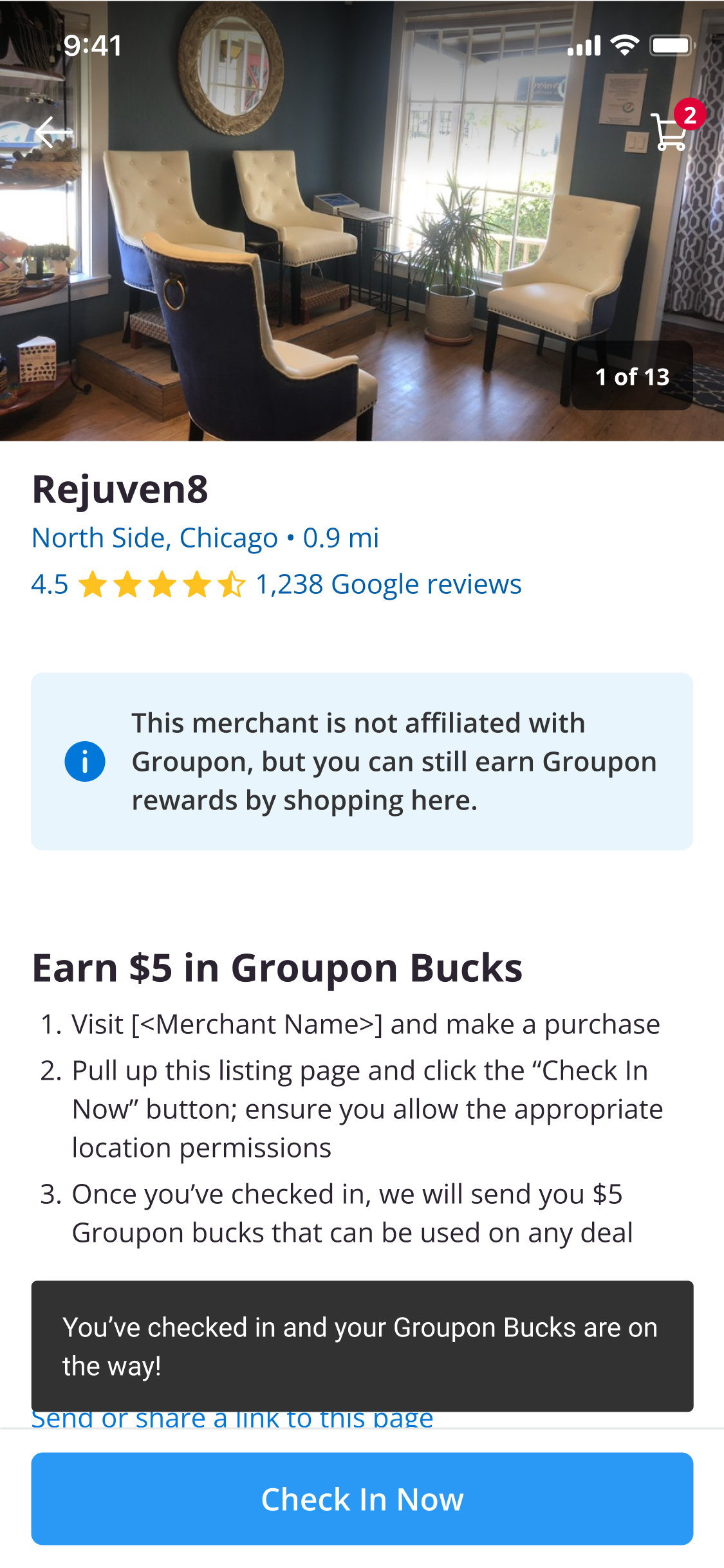
- How do we incentivize clicks while also clarifying there is no affiliation with Groupon, or no deals?
- Can we incorporate a brand expansion strategy?
- How do we market this feature?
- We’ll need coach marks/feature awareness.
- Can we rank deal merchants first in comingled feeds?
- How far will customers go to earn Groupon Bucks (historically not a driver)?
- How quickly can we launch a proof-of-concept by repurposing existing templates?


Customer’s always expect deals on Groupon. Without deals, we would need a serious brand strategy. In user research, the first consumer question was always “Why!?” The same went for my product design team. For board presentations, I worked with our CEO to highlight our brand position as a local marketplace platform that could support and serve hyper-local economies and further boost Groupon’s brand strength regardless of deals.


I worked with Product and Engineering teams to use our existing exposed filter toggle to create design options for surfacing non-deal inventory with landing pages. We presented options with various levels-of-effort to match degrees of tolerance for timing from our our executive teams who were matching feature releases to quarterly shareholder meetings.
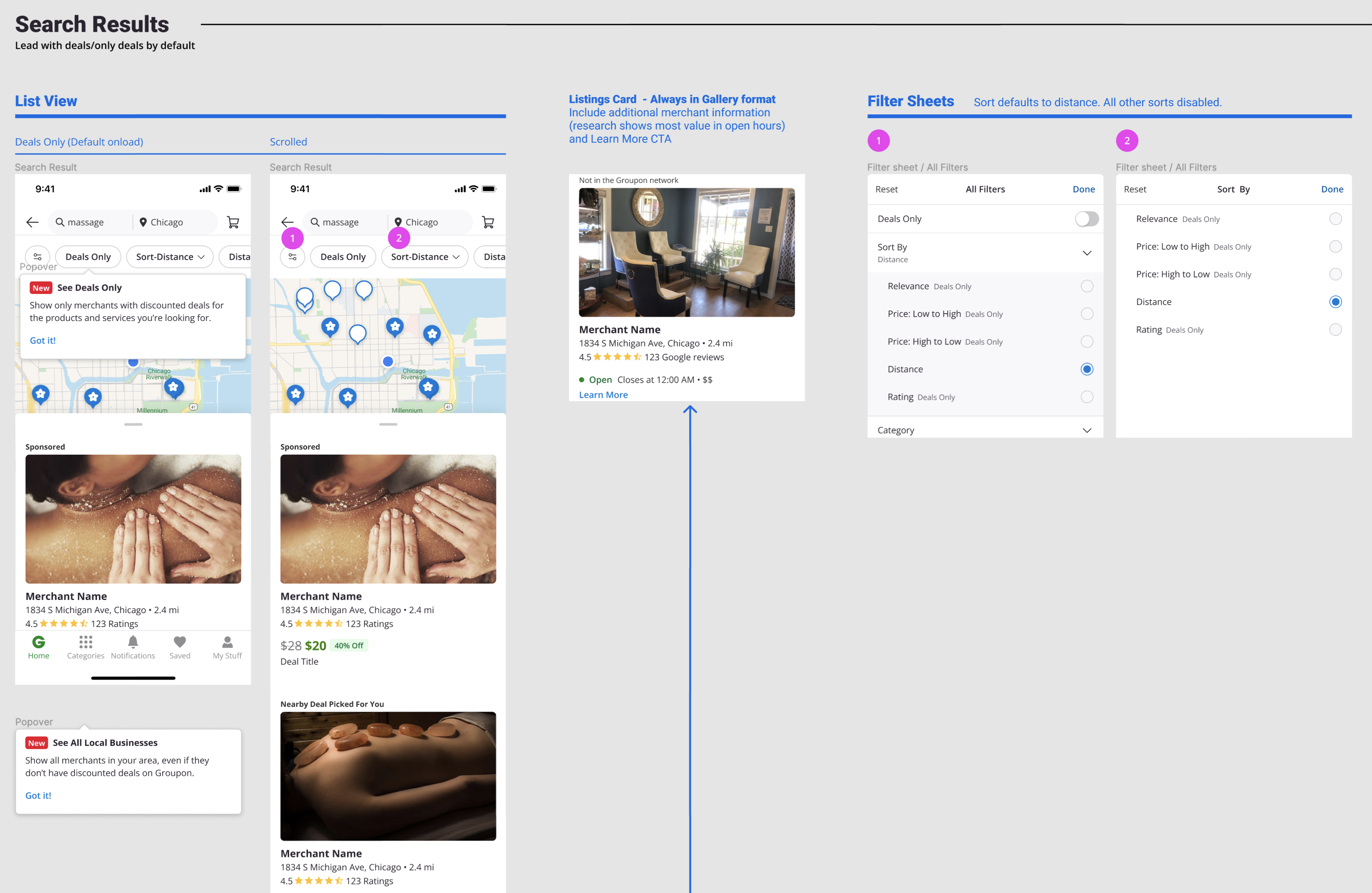
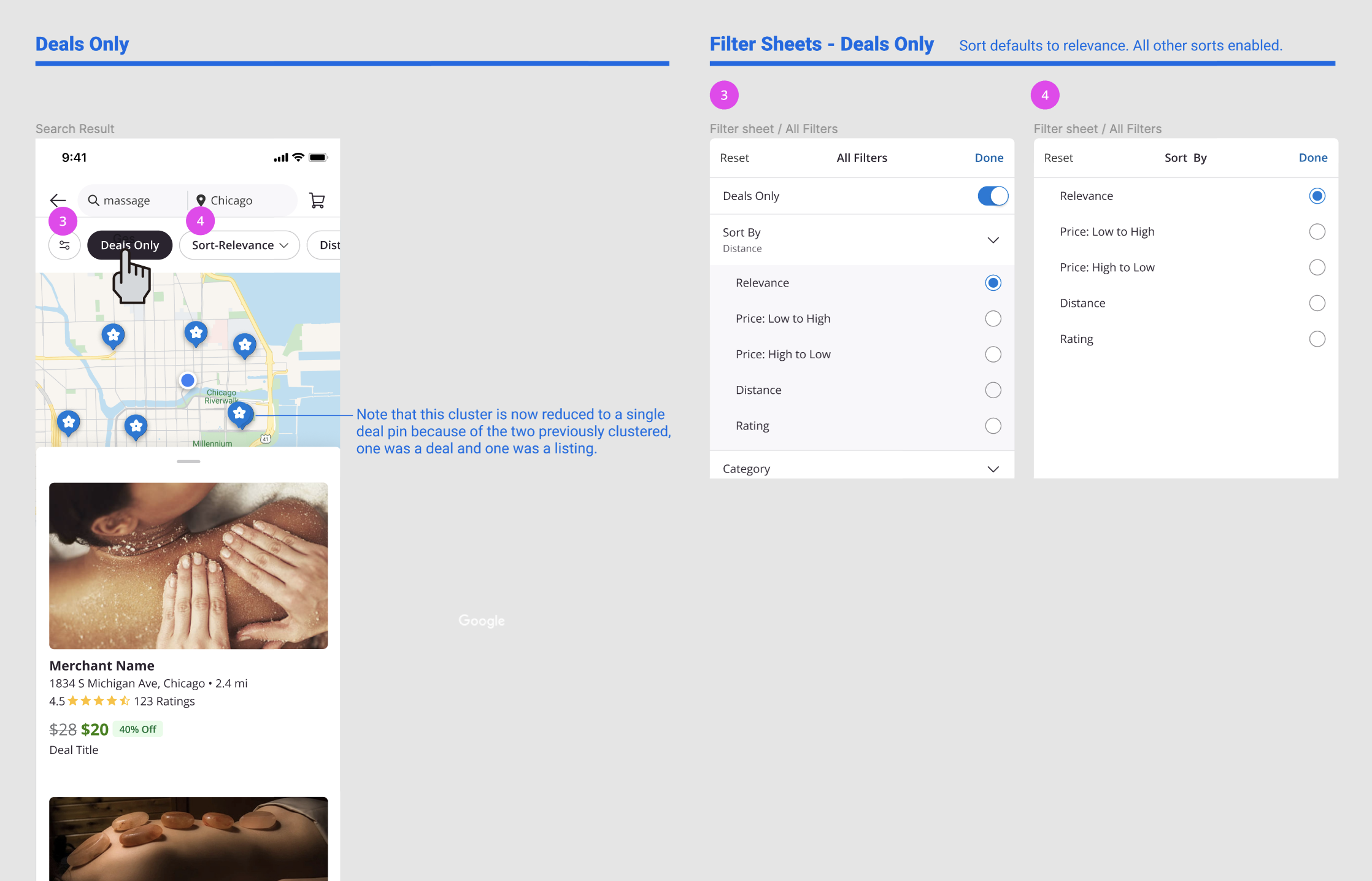
In the end, we launched our end-to-end MVP experiments in limited markets with an aggressive line-up of fast follows and research studies to make quick adjustments and evolve the product.
